AI Art & Video Generator
Imagine and create with Windy
AI Video & Art Generator
Accelerate your video and content production with WindyBot AI suite of AI services. Get inspired, reimagine with AI and 10X your content creation today.
AI Video Generator
Create videos in any style with a prompt.
Windy AI Video is our cutting-edge AI video generator tool. Create videos by using text prompts and describing the scene. Specify the style with options such as cinematic, animation, abstract, or documentary styles. Generate promotional videos, animated clips, social media reels, and more! Our video models support advanced AI models such as Kling Pro, Hunyuan Pro, Minimax, CogVideoX, DreamMachine, Haiper and other generative video models with resolutions up to 4K. You can also create videos using reference images or videos as the starting image. Craft your AI videos for marketing, blogs, social media, advertisements, and other creative needs.
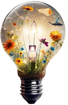
AI Art & Image Generator
Generate art in any style with prompt.
Windy Art is our state-of-the-art AI image generator tool. Generate art by using text prompting and describing the image. Specify the style with choices from pencil drawing, watercolor, abstract, charcoal and many other styles. Generate tattoo art, clipart, t-shirt designs, anime pfps and much more! Our image models support SDXL, Stable Diffusion, Dalle, Flux, Sana and other advanced SOTA models with 1024X1024 resolution that can be upscaled to higher resolutions like 2048X2048. You can also create an image by using a reference image as the starting image. Create your AI art and use it for your marketing, blog, social meta, posters and other design needs.